SafeGold
TrueMoney
TrueMoney — SafeGold
TrueMoney — SafeGold
Overview
Overview
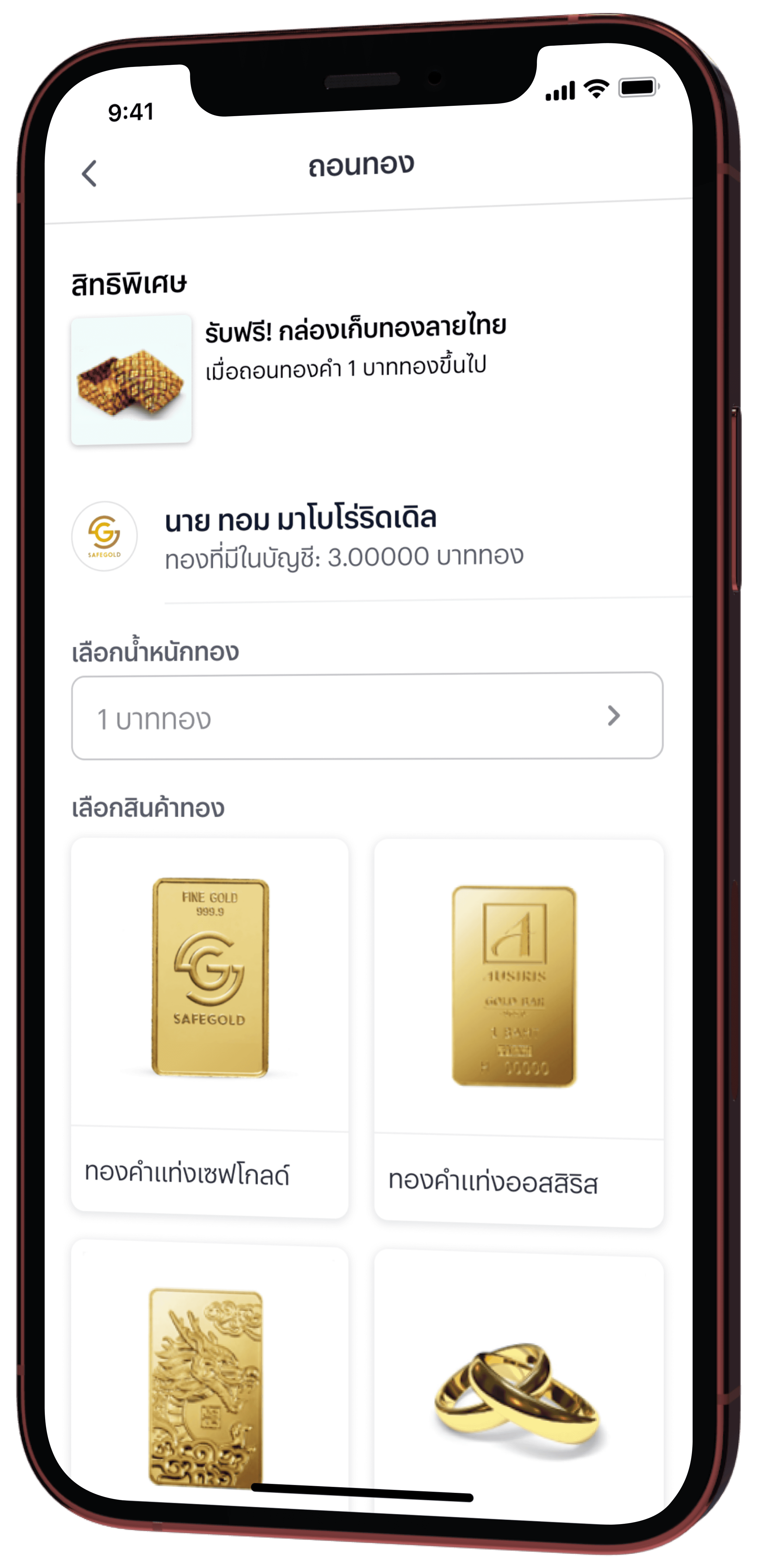
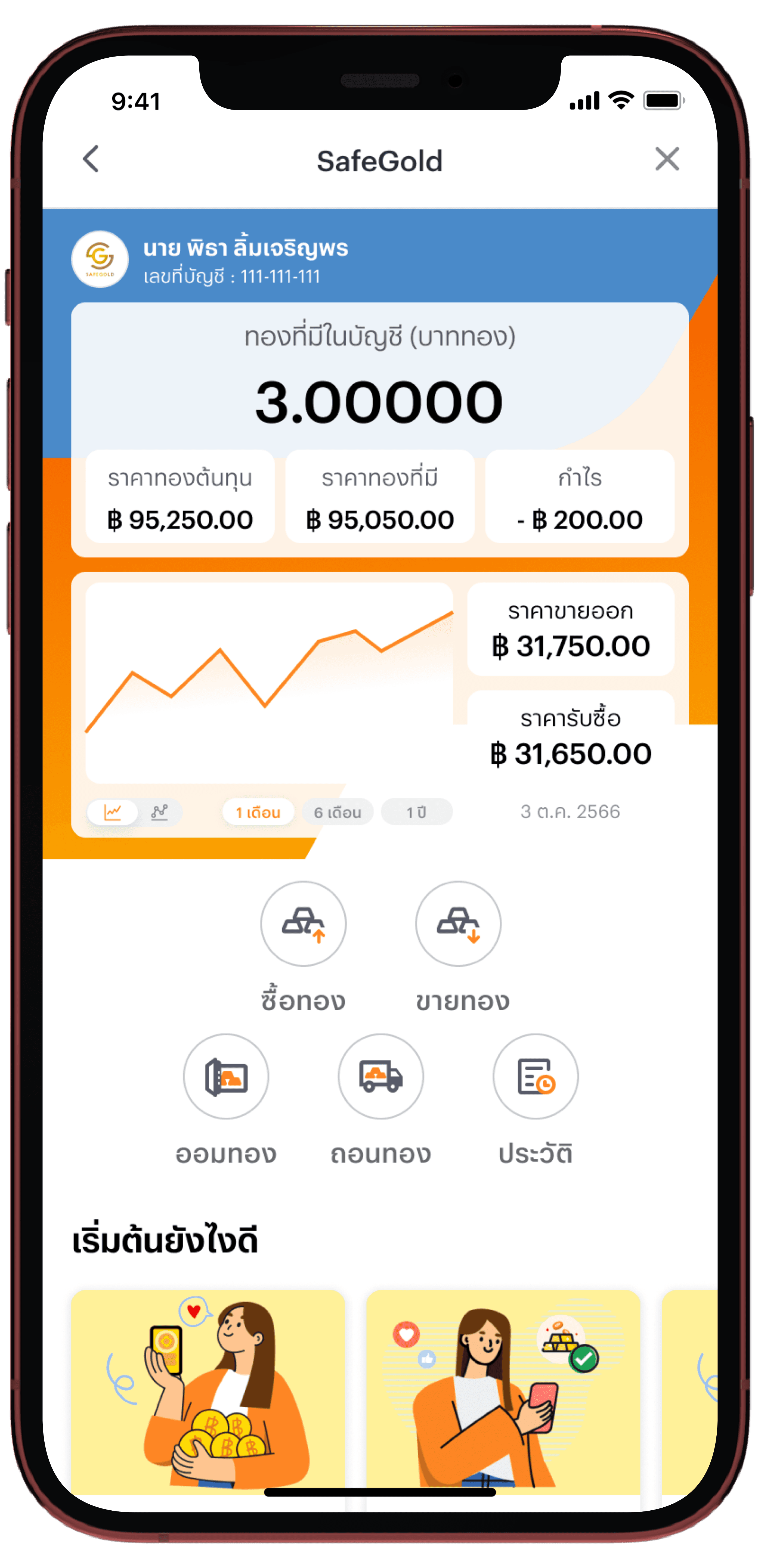
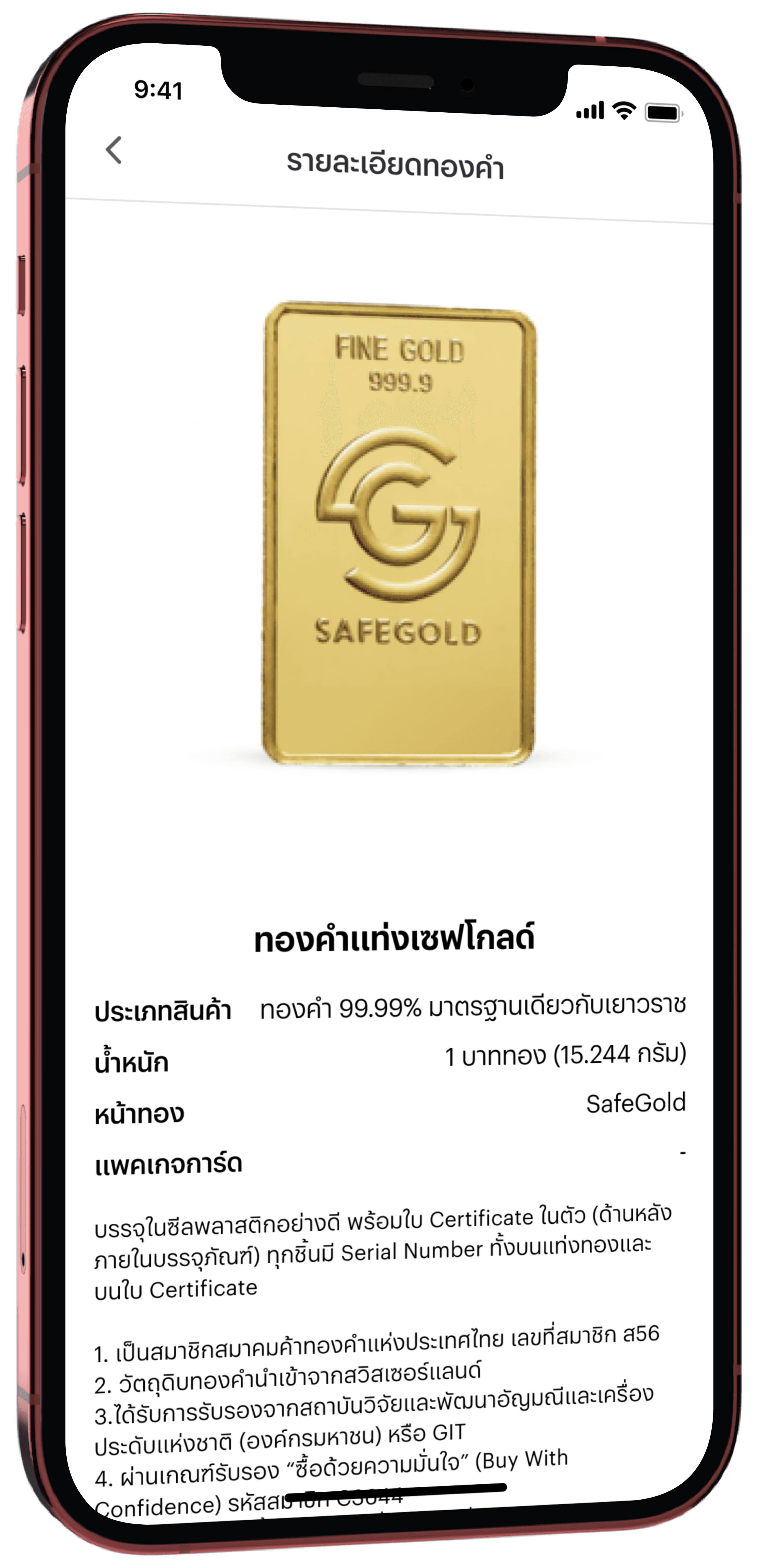
A gold investment platform is integrated into the TrueMoney Application, which provides financial services, such as money transfers, digital wallet, bill payments, mobile top-ups, and more.
A gold investment platform is integrated into the TrueMoney Application, which provides financial services, such as money transfers, digital wallet, bill payments, mobile top-ups, and more.
This project undertaken as part of an internship and cooperative education program with my university. It is being developed in collaboration with the product designer team, under the guidance of the product design leader.
This project undertaken as part of an internship and cooperative education program with my university. It is being developed in collaboration with the product designer team, under the guidance of the product design leader.
Tools
Tools
Figma
Mural
Figma
Mural
Duration
Duration
6 months
(June - November 2023)
6 months
(June - November 2023)


Source : Khaosod


Source : Khaosod


Source : Khaosod
Context
Context
Investing in gold is a popular choice for many people looking for a safe and profitable investment.
However, buying gold the traditional way can be difficult. It often requires a lot of money, secure storage, knowledge about gold, finding a trustworthy store, and spending time visiting stores or waiting in line to buy.
EMPATHIZE
EMPATHIZE
IDEATE
IDEATE
EMPATHIZE
EMPATHIZE
Proto-Persona
Proto-Persona
A proto-persona is created to help the team align on who our user might be before collecting data to identify who the actual persona is, through workshops with team members by using Mural.
A proto-persona is created to help the team align on who our user might be before collecting data to identify who the actual persona is, through workshops with team members by using Mural.


Questionniars
Questionniars
We use questionnaires to quickly gather data from a large group of users, helping us understand their needs, behaviors, pain points, and preferred tools.
We use questionnaires to quickly gather data from a large group of users, helping us understand their needs, behaviors, pain points, and preferred tools.
Tool : Google Form
Tool : Google Form
Duration : 4 days
Duration : 4 days
Respondents : 55 responses
Respondents : 55 responses
Validated Persona
Validated Persona
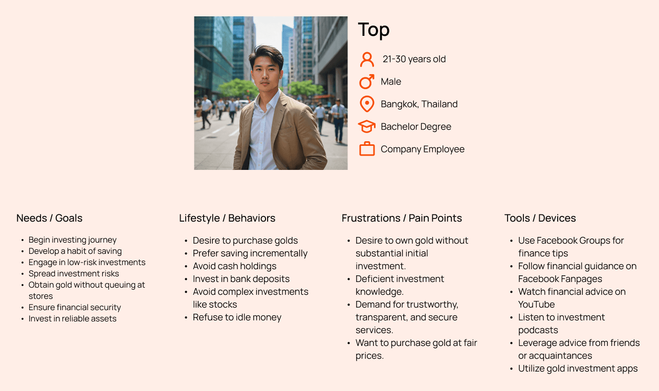
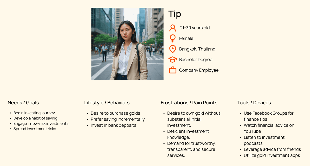
Based on real user research and data collected from surveys, make it easier to understand the target audience.
Based on real user research and data collected from surveys, make it easier to understand the target audience.




Empathy Map
Empathy Map
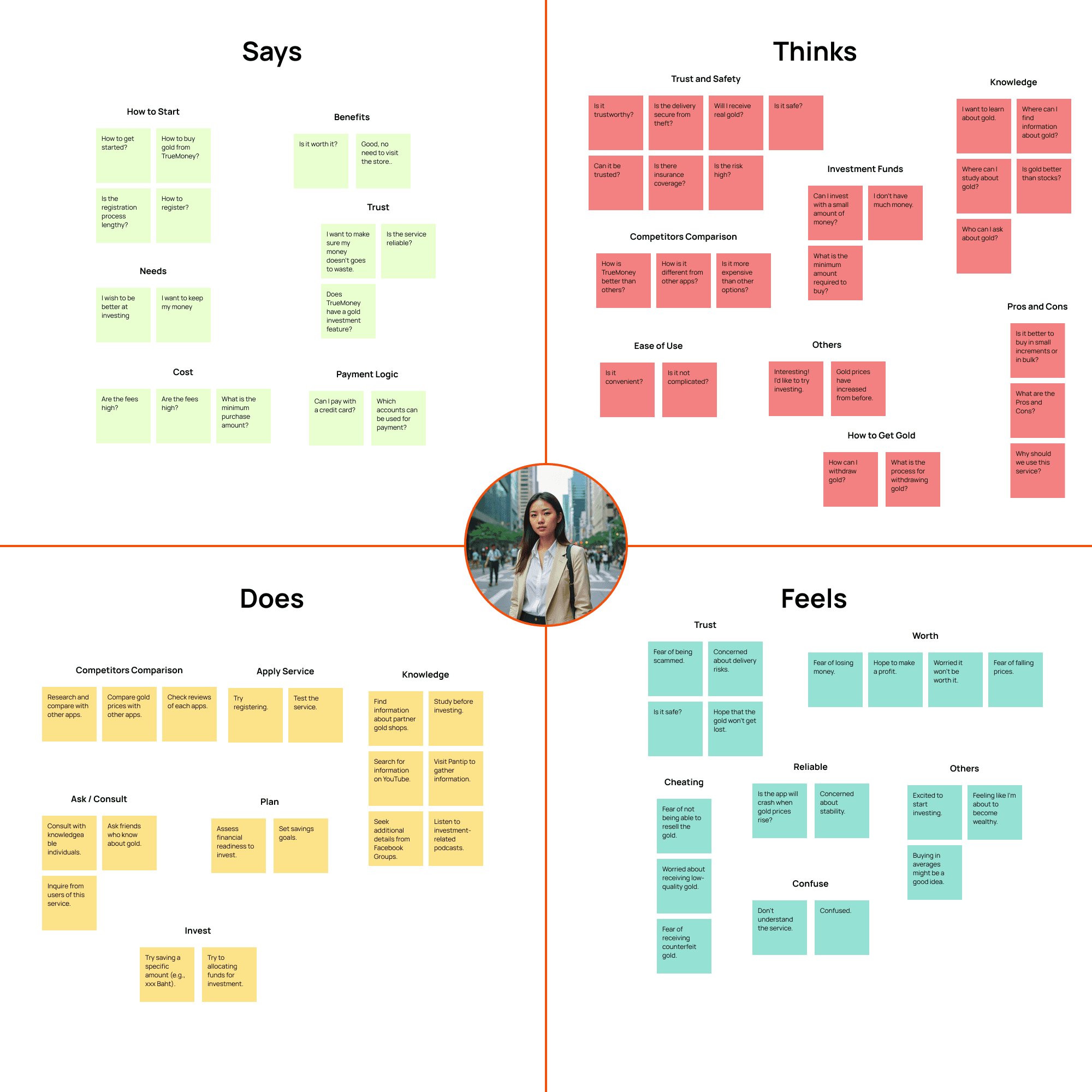
This map was created during a brainstorming workshop with team members using Mural to better understand user needs.
This map was created during a brainstorming workshop with team members using Mural to better understand user needs.
Journey Map
Journey Map
To provide an overview of this feature from a user's perspective, there are four main scenarios: registering as a member, buying gold, selling gold, and withdrawing gold.
To provide an overview of this feature from a user's perspective, there are four main scenarios: registering as a member, buying gold, selling gold, and withdrawing gold.
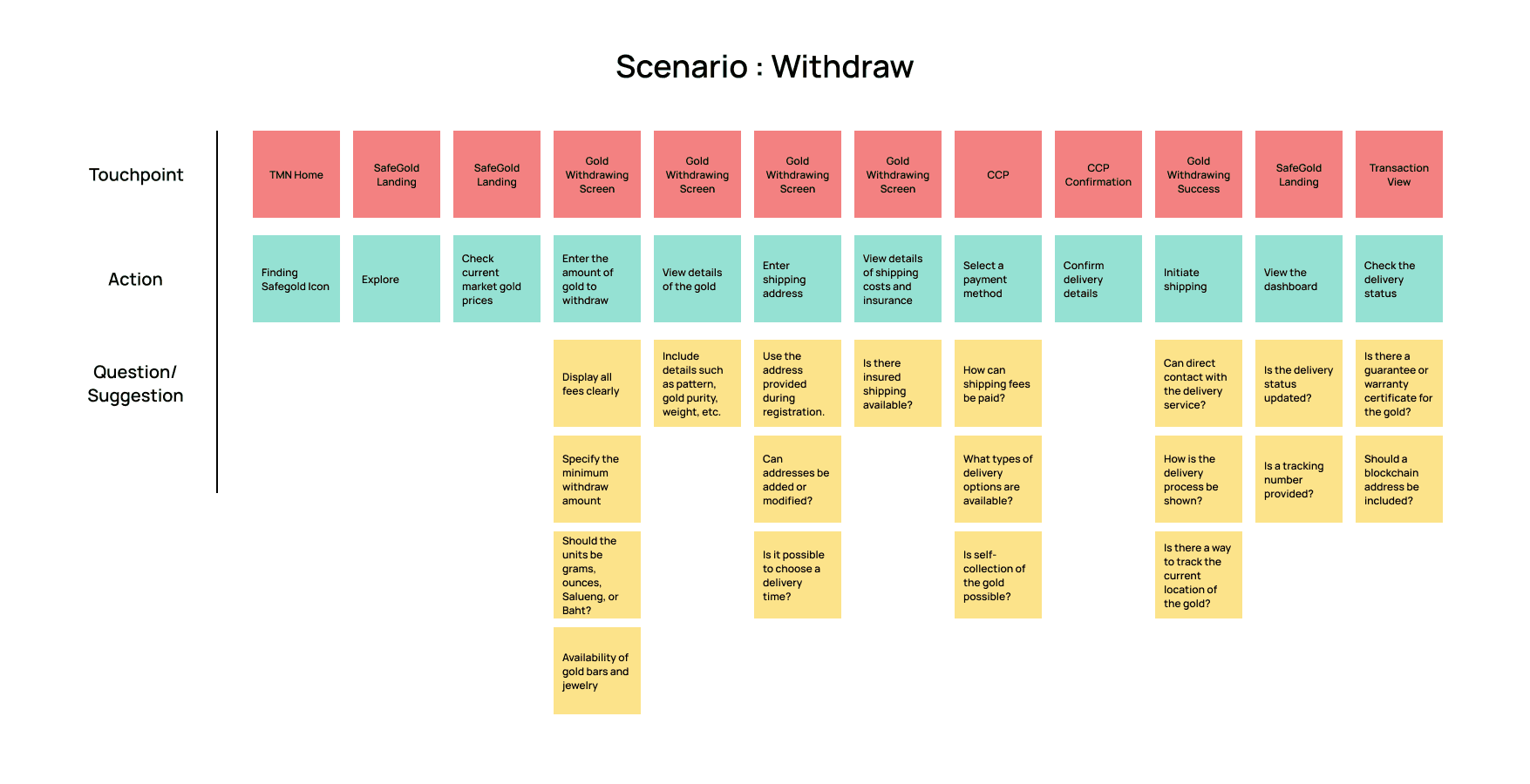
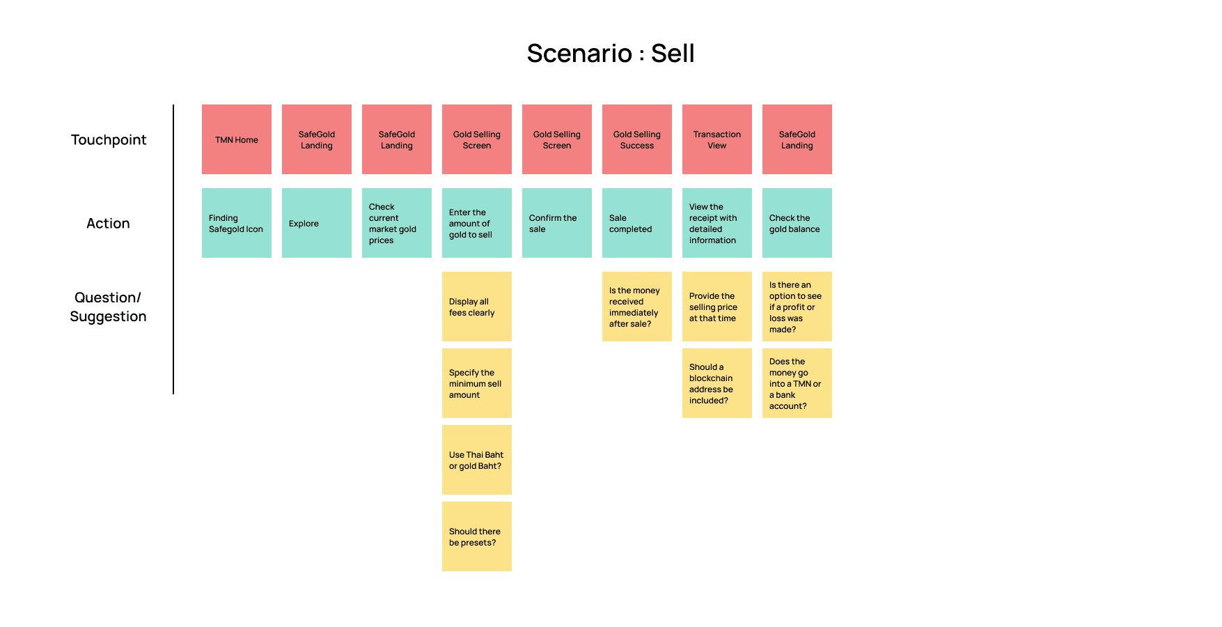
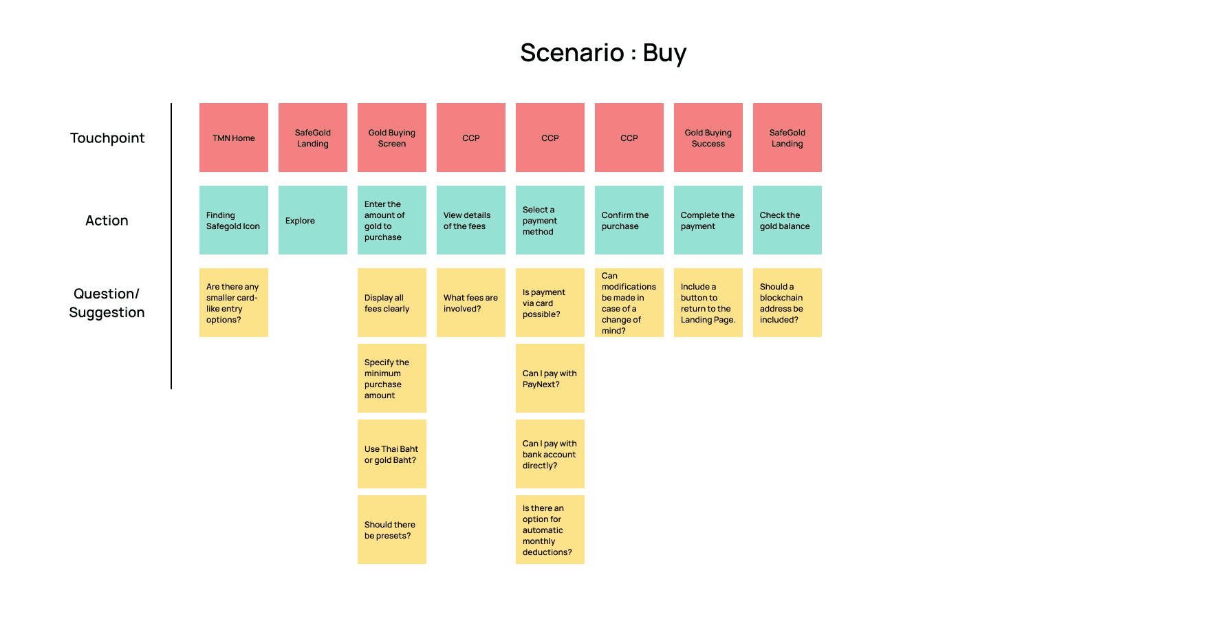
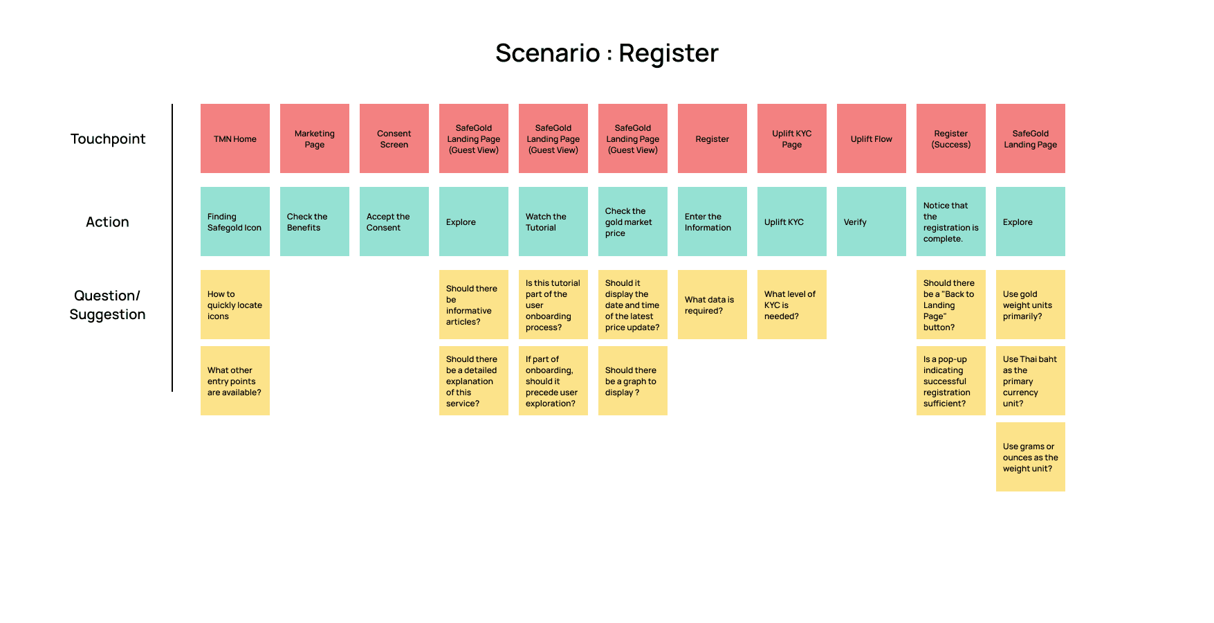


*Some details were changed later.
*Some details were changed later.
DEFINE
DEFINE
Competitors Analysis
Competitors Analysis
At this process, we conducted a competitive analysis focusing on the features offered, their advantages and disadvantages, transaction-related details, and design aspects. We considered direct competitors as domestic service providers and indirect competitors as international service providers.
At this process, we conducted a competitive analysis focusing on the features offered, their advantages and disadvantages, transaction-related details, and design aspects. We considered direct competitors as domestic service providers and indirect competitors as international service providers.
8
Direct Competitors
Direct Competitors
4
Indirect Competitors
Indirect Competitors
After that, we decided to include the following features:
After that, we decided to include the following features:
Buy
Buy
Sell
Sell
Save
Save
Withdraw
Withdraw
IDEATE
IDEATE
User Flow
User Flow
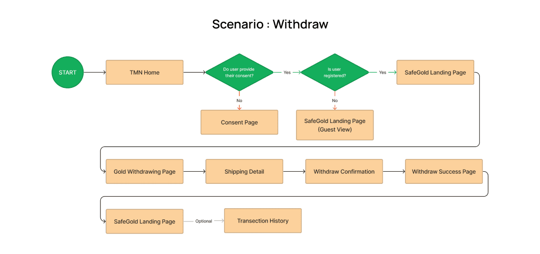
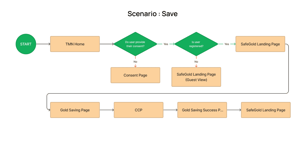
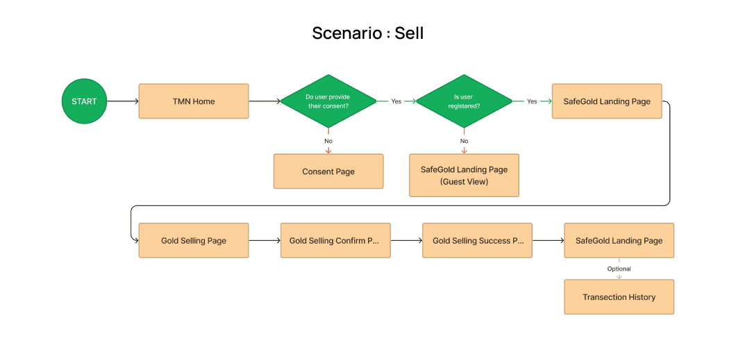
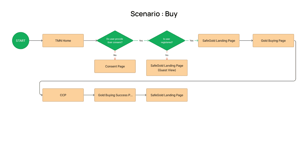
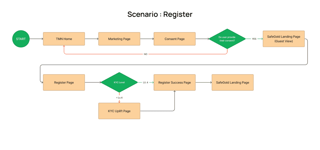


*Some details were changed later.
*Some details were changed later.
Information Architecture
Information Architecture
Since the landing page contains the most information, it is essential to prioritize and organize the data effectively.
Since the landing page contains the most information, it is essential to prioritize and organize the data effectively.
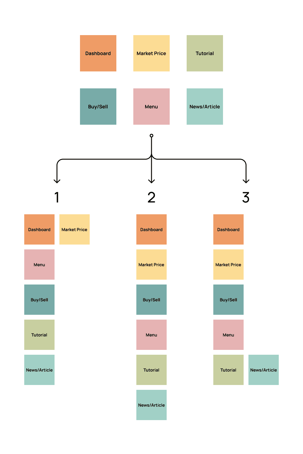


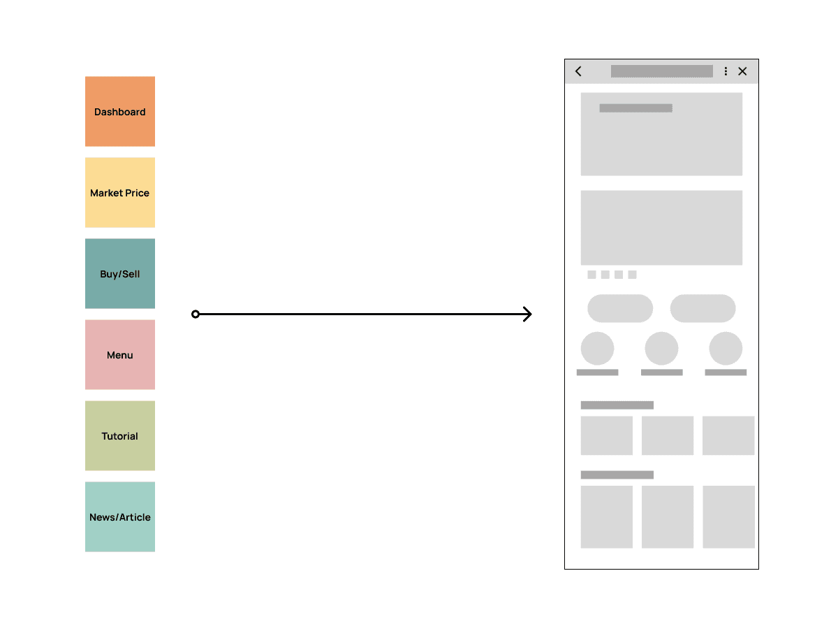

We designed three different layouts and discussed which would be the most suitable. After deliberation, we decided to go with the second design.
We designed three different layouts and discussed which would be the most suitable. After deliberation, we decided to go with the second design.
Wireframe
Wireframe
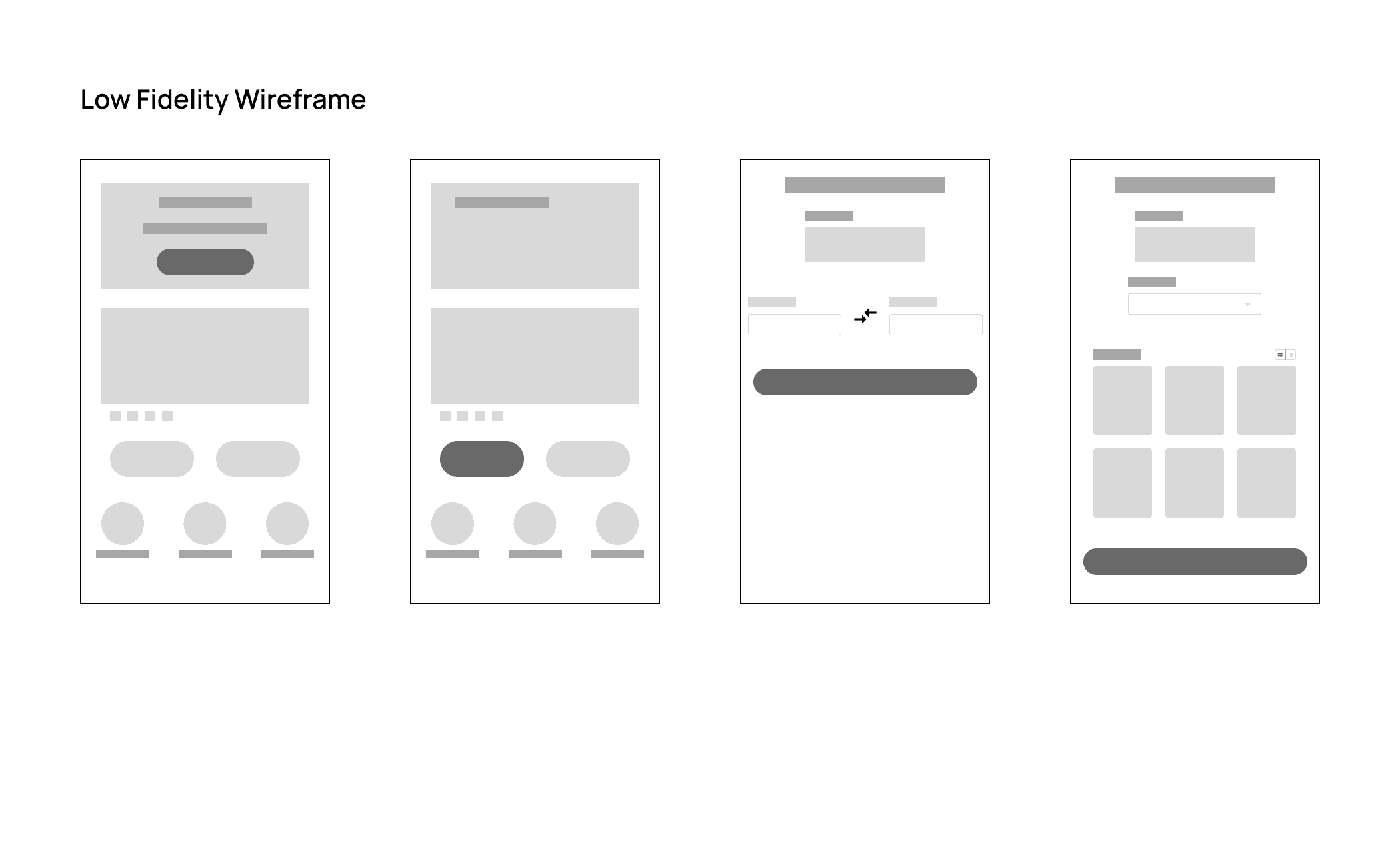
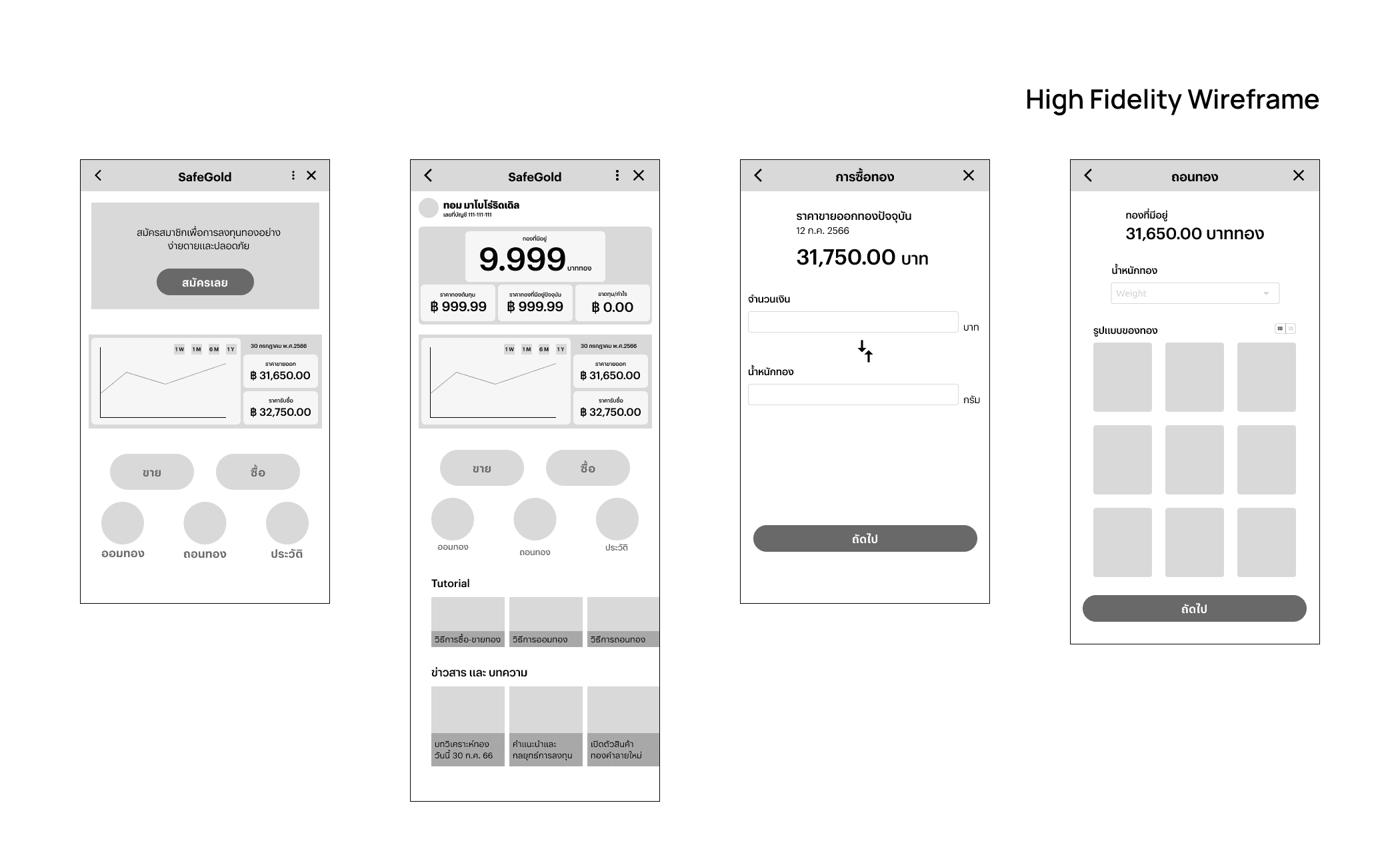
After a period of research, We developed wireframes to illustrate the basic structure and functionality of the application. We started with low-fidelity (lo-fi) wireframes and progressed to high-fidelity (hi-fi) versions. Here are some of the wireframes.
After a period of research, We developed wireframes to illustrate the basic structure and functionality of the application. We started with low-fidelity (lo-fi) wireframes and progressed to high-fidelity (hi-fi) versions. Here are some of the wireframes.


PROTOTYPE
— Wireframe
PROTOTYPE
— Wireframe

the prototype showcase is optimized for larger screens.
Apologies,

the prototype showcase is optimized for larger screens.
Apologies,
Task : Register an Account
Task : Register an Account
Task : Register an Account
Prototype
Prototype
After completing the high-fidelity (hi-fi) wireframes, we then created a prototype for testing.
After completing the high-fidelity (hi-fi) wireframes, we then created a prototype for testing.
The prototype consists of five parts: registering as a member, buying gold, selling gold, saving gold, and withdrawing gold. This will be tested to identify any issues in the next phase and to collect data for improvements before developing the user interface (UI).
The prototype consists of five parts: registering as a member, buying gold, selling gold, saving gold, and withdrawing gold. This will be tested to identify any issues in the next phase and to collect data for improvements before developing the user interface (UI).
TEST
— Wireframe
TEST
— Wireframe
Concept Test
Concept Test
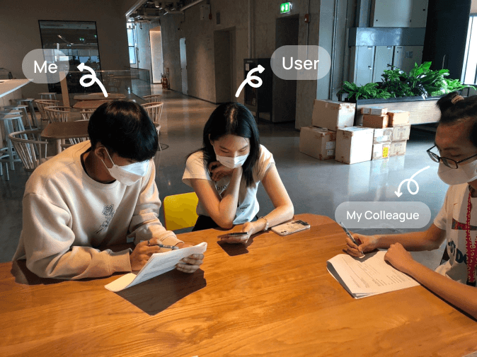
The testing of this prototype wireframe was conducted through interviews and by having participants perform each task according to the prototype.
The testing of this prototype wireframe was conducted through interviews and by having participants perform each task according to the prototype.
Began with an interview, starting with general questions about the user and followed by questions about gold and investing.
Began with an interview, starting with general questions about the user and followed by questions about gold and investing.

Each task was tested using the Single Ease Question (SEQ) to assess the difficulty or ease of use, and included specific questions about each task.
Each task was tested using the Single Ease Question (SEQ) to assess the difficulty or ease of use, and included specific questions about each task.
What is Single Ease Question (SEQ)?
a usability metric that measures how easy it is to use a feature in a product. After users have completed a task, they rate their experience on a scale from 1 to 7, where 1 is very hard and 7 is very easy. See More Details
a usability metric that measures how easy it is to use a feature in a product. After users have completed a task, they rate their experience on a scale from 1 to 7, where 1 is very hard and 7 is very easy. See More Details
After all tests, additional questions were asked to gather more insights from users and to explore potential interest in features that could be added later.
After all tests, additional questions were asked to gather more insights from users and to explore potential interest in features that could be added later.
Test Result
Test Result
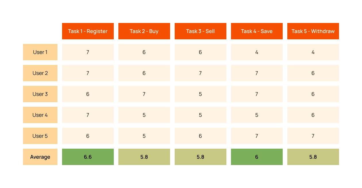


The test results from all five users were generally positive, but there are still some issues that need to be addressed.
The test results from all five users were generally positive, but there are still some issues that need to be addressed.
The Problems
The Problems
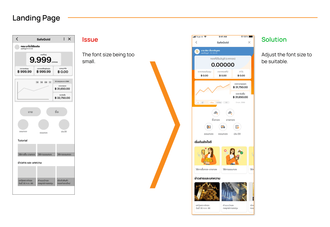
Landing Page has an issue with the font size being too small, causing some users to zoom in to read the information.
Landing Page has an issue with the font size being too small, causing some users to zoom in to read the information.
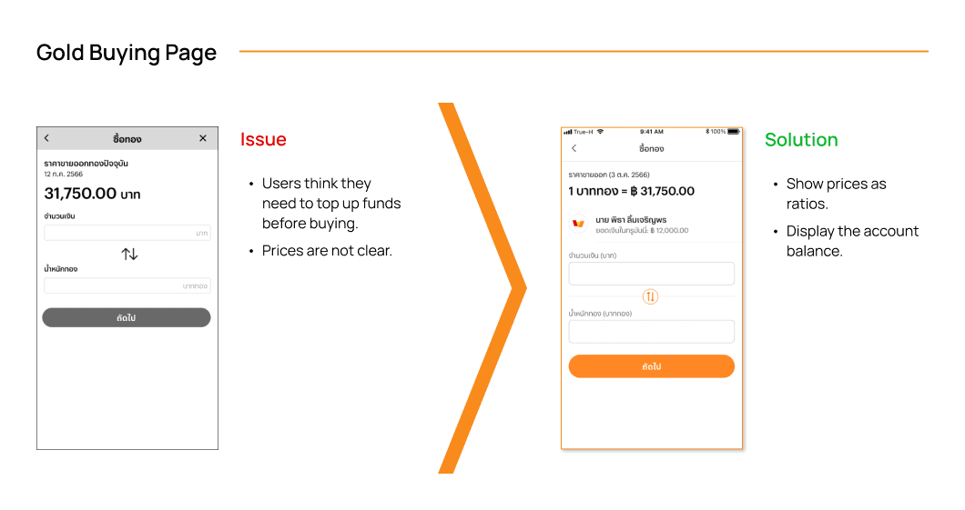
Gold buying page, users are unaware of their remaining balance, leading to confusion over needing to top up funds before buying gold. Since the balance is displayed on the main TrueMoney page.
Gold buying page, users are unaware of their remaining balance, leading to confusion over needing to top up funds before buying gold. Since the balance is displayed on the main TrueMoney page.
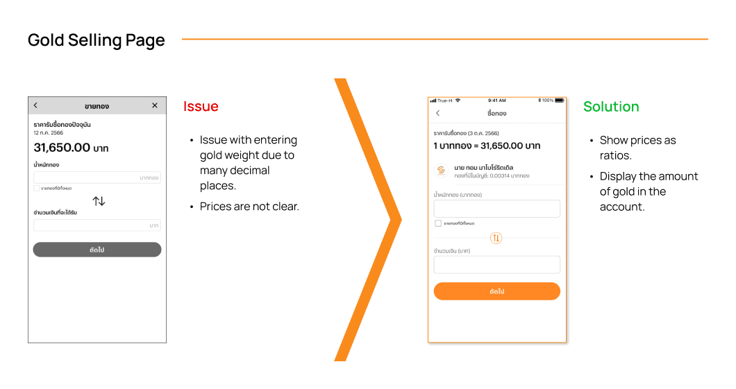
Gold selling page has similar issues as the buying page regarding price display and problems with entering gold weight due to many decimal places.
Gold selling page has similar issues as the buying page regarding price display and problems with entering gold weight due to many decimal places.
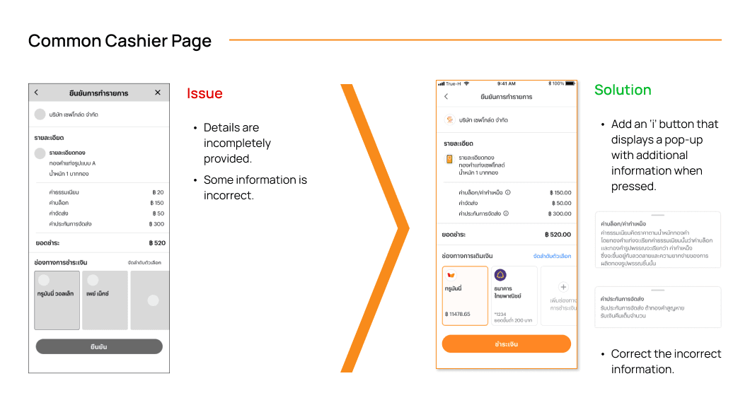
Common Cashier Page, users seek more details about various fees and insurance, and there are errors in terminology(fees and block charges).
Common Cashier Page, users seek more details about various fees and insurance, and there are errors in terminology(fees and block charges).
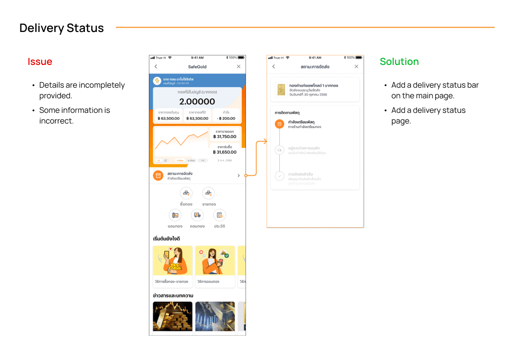
Gold Withdrawing Page and the Delivery Status, some users do not know where to check the status of their delivery. Even those aware that it should be viewed under history still have trouble finding it.
Gold Withdrawing Page and the Delivery Status, some users do not know where to check the status of their delivery. Even those aware that it should be viewed under history still have trouble finding it.
IDEATE
IDEATE
User Interface
User Interface
Since we had identified the issues during the wireframe testing, we devised solutions to enhance the UI design.
Since we had identified the issues during the wireframe testing, we devised solutions to enhance the UI design.










PROTOTYPE
— UI
PROTOTYPE
— UI

the prototype showcase is optimized for larger screens.
Apologies,

the prototype showcase is optimized for larger screens.
Apologies,
Task : Register an Account
Task : Register an Account
Task : Register an Account
Prototype
Prototype
After refining and designing the UI, I created a prototype for testing. The prototype consists of five sections, similar to the Wireframe.
After refining and designing the UI, I created a prototype for testing. The prototype consists of five sections, similar to the Wireframe.
TEST
— UI
TEST
— UI
Usability Test
Usability Test
The testing of this UI prototype will be conducted similarly to the wireframe testing, involving interviews and having users complete each task according to the prototype. However, the users participating in this testing phase will be different from those who tested the wireframes.
The testing of this UI prototype will be conducted similarly to the wireframe testing, involving interviews and having users complete each task according to the prototype. However, the users participating in this testing phase will be different from those who tested the wireframes.
Test Result
Test Result
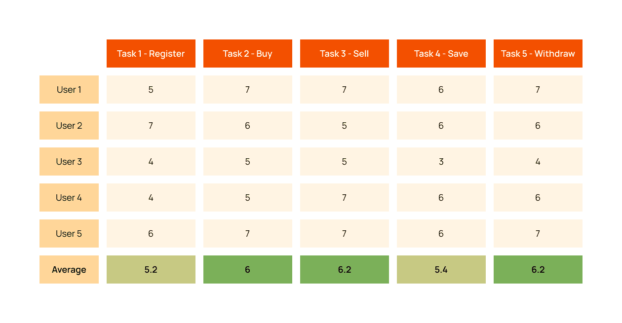


The test results from all five users were generally positive, similar to the previous testing phase, but new issues were identified.
The test results from all five users were generally positive, similar to the previous testing phase, but new issues were identified.
The Problems
The Problems
Task 1
Personal information display is difficult to read.
Requires entering excessive additional information.
Task 1
Personal information display is difficult to read.
Requires entering excessive additional information.
Task 3
Gold Selling Page, users are confused about whether they can specify the exact amount of money they want and the page does not indicate the minimum sale amount.
Task 3
Gold Selling Page, users are confused about whether they can specify the exact amount of money they want and the page does not indicate the minimum sale amount.
Task 5
Gold Saving Page, users spend a considerable amount of time reading about how to save, means the information difficult to understand, and are unclear on how saving differs from buying.
Task 5
Gold Saving Page, users spend a considerable amount of time reading about how to save, means the information difficult to understand, and are unclear on how saving differs from buying.
CONCLUSION
CONCLUSION
This internship project at a large company was really valuable. It helped me better understand the design thinking process, especially learning about user needs through interviews and usability testing. Working with a team of designers showed me how important communication and teamwork are.
Additionally, working on a project focused on investments increased my knowledge of financial behaviors. These experiences have improved my skills, making me a more flexible designer ready to face different challenges.
LET’S
WORK
TOGETHER!
LET’S WORK
TOGETHER!
LET’S WORK
TOGETHER!
Contact
© 2024 Chertaem Wanleeluck. All Rights Reserved.
Version 2.0

